
Matte or gloss starts with how the print will be used
Choosing between matte and gloss is not only about looks. It is about where the piece will sit, how close people will stand to it, and whether the goal is sharp visibility or strong colour punch. A laminated menu in a busy restaurant has different needs from a framed art print in a gallery, and a training chart in a factory needs different handling again.
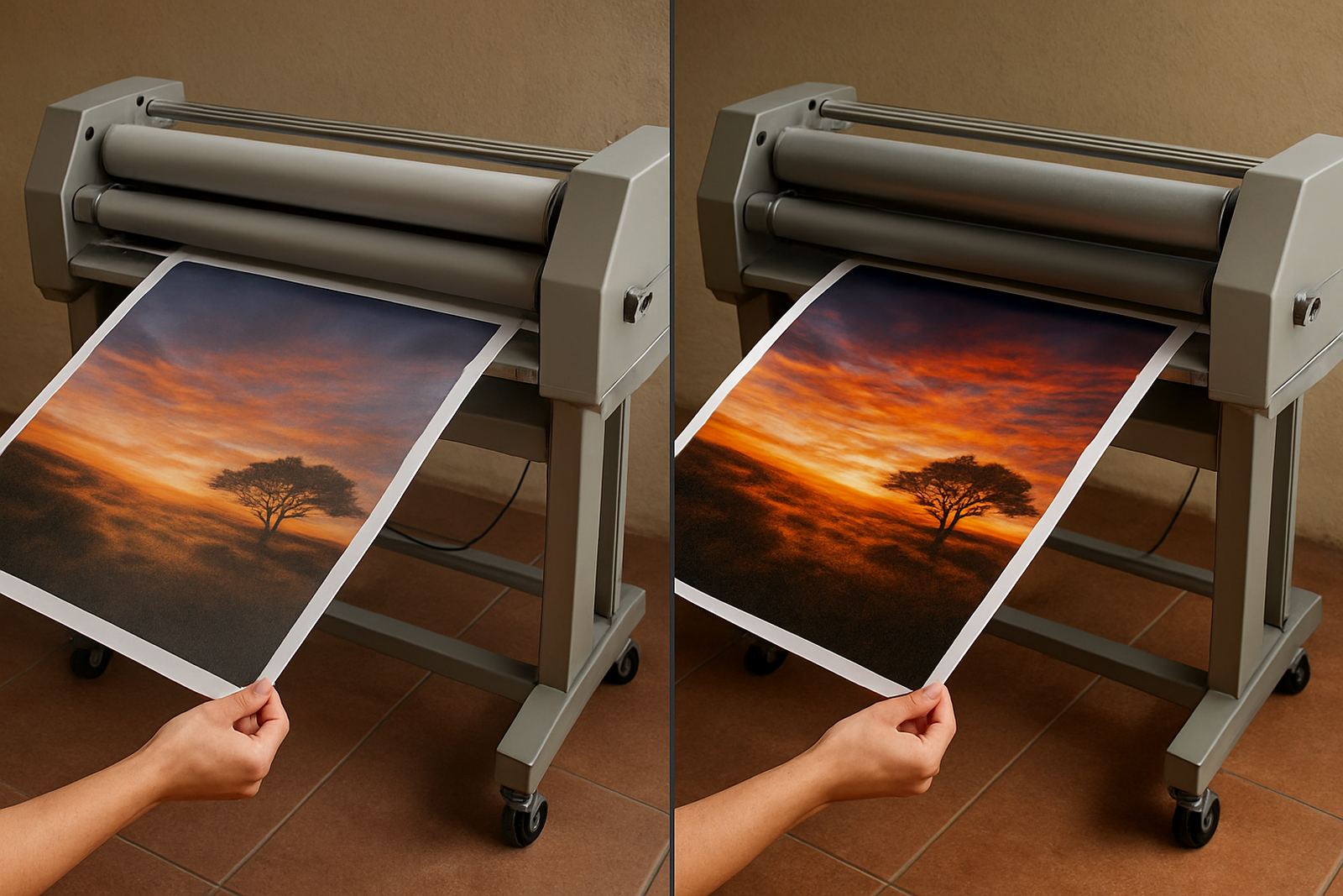
Gloss gives a brighter surface with stronger contrast. Colours tend to appear deeper and blacks look richer. Matte reduces glare and softens reflections, which makes it easier to read under fluorescent tubes, shop lighting and daylight near windows. In practical terms, the finish should support the message. If people need to read information quickly, matte is often the safer option. If the print must catch the eye, gloss can do more work.
At Laminator in Kya Sand, Johannesburg, we see this question often from print shops in Randburg and Sandton, as well as designers supplying schools, offices and display work across Gauteng. The right answer usually comes down to the end use, not just the artwork itself.
When matte is the better choice
Matte film is the practical option where readability matters more than shine. It cuts reflections, so text and fine detail stay clearer under bright lights and in rooms with a lot of natural light. That makes it useful for wayfinding signs, price boards, exhibition panels and presentation prints that will be viewed up close.
It also suits artwork that has softer tones or textured detail. Watercolour reproductions, architectural boards and photography that should look calm rather than vivid often benefit from a matte finish. The surface gives a more restrained appearance, which many clients prefer for premium documents and framed pieces. The print feels more considered, less flashy, and the finish can hide fingerprints better too.
- Best for readable text and technical information
- Better under strong indoor lighting or sunlight
- Useful for art prints with subtle colour shifts
- Hides fingerprints and light scuff marks well
There is one point to keep in mind. Matte can slightly mute colour depth, so if a brand relies on very bold reds, blues or black imagery, you need to confirm that the softer appearance still fits the brief. A quick test sheet helps. It saves reprinting later and gives the client something real to compare, not a guess.
Where gloss gives you more impact
Gloss finish is chosen when a print must stand out from a distance. The shiny surface increases contrast and makes colour feel more vivid. This is useful for retail displays, event graphics, promotional panels and photographs where the image itself is the main selling point. If the print is going into a controlled indoor area and glare is not a problem, gloss can make the work look sharper and more lively.
It also adds a polished presentation effect. For some clients that extra shine signals quality and attention to detail. In a showroom in Midrand or a sales office in Pretoria, a gloss laminated panel can help a display feel more confident and more presentable. The finsh is less forgiving in bright light though, so placement matters.
- Best for strong colour and visual impact
- Works well for retail and promotional graphics
- Suitable where the print is viewed front on
- Can show reflections in bright rooms
Gloss will also show fingerprints more easily, especially on dark graphics and darker corners. For items handled often, such as menus, folders or counter signs, that means more cleaning. If the client is in a coastal area or moving goods between sites, ask how often the item will be touched and wiped down before choosing the finish.
Readability, colour depth and presentation effect compared
The simplest way to compare matte and gloss is to think of three outcomes: readability, colour depth and presentation effect. Matte wins on readability in difficult lighting. Gloss wins on colour depth and visual punch. Presentation is more subjective, but matte usually feels calm and professional while gloss feels brighter and more promotional.
For business use, the decision often follows the message:
- Information first, choose matte
- Image first, choose gloss
- Mixed text and image, test both before bulk production
- High traffic handling, consider matte for easier maintenance
It is worth matching the finish to the viewing distance too. A large wall graphic viewed from across a room can take gloss well. A certification board that people read at arm’s length often does better in matte. If the print has fine lines, small type or pale backgrounds, glare can quickly become the problem. On the other hand, if the job relies on photographs or bold branding, matte may feel too flat.
Local conditions in Johannesburg can influence the finish
South African working conditions matter more than many people expect. In Johannesburg, office lighting, load-shedding recovery and changing indoor temperatures can all affect how a laminated piece is viewed. A gloss sheet that looks excellent in the workshop may glare badly under LED fittings in Sandton or at a reception counter in Randburg. A matte surface is often easier on the eye in these spaces.
Coastal humidity is another factor for nationwide installs, especially where prints travel to Durban, Gqeberha or the Cape. The laminate itself needs to hold up, but the finish should also match how the item will be handled and cleaned. For a restaurant menu board, a matte surface can reduce the look of wipe marks. For a showroom poster, gloss may be acceptable if the lighting is planned properly.
For clients in Kya Sand, East Rand and Pretoria, we often suggest checking the finished sample under the same light where it will be used. That simple step prevents surprises. It also makes approval easier when a client is comparing two versions side by side.
A practical choice for print shops, artists and business clients
There is no single winner between matte and gloss. The best choice depends on whether the job must inform, impress or both. Print shops often keep both options available because different customers want different outcomes. Graphic designers usually lean matte for corporate work and gloss for vibrant promo pieces. Artists may choose matte when they want a print to feel gallery-like, while gloss suits bold colour work and photography.
Before placing a run, ask these questions:
- Will people read this closely or see it from a distance?
- Will the item sit under bright lights or near windows?
- How often will it be touched, cleaned or moved?
- Does the artwork need soft detail or strong colour depth?
That thinking leads to fewer reprints and better results. If you are unsure, ask for a sample or test two finishes on the same file. A 5 minute comparison can save a lot of time once the full job is under way. For businesses serving Johannesburg and the surrounding areas, this practical approach usually gives the clearest answer.
Getting the finish right before the final run
Matte and gloss both have a place in professional laminating. The real question is what the print needs to do after it leaves the machine. If the main goal is legibility, matte is usually the safer choice. If the main goal is colour impact and presentation, gloss is often better. For many jobs, the right answer is decided by the room, the light and how often the item will be handled.
At Laminator in Kya Sand, we work with print shops, designers and artists who need finishes that suit local conditions and commercial use. Whether the job is heading to Sandton, Midrand, Pretoria or further afield, a well chosen finish makes the work easier to read and better to present. Get that part right, and the rest of the job falls into place.