
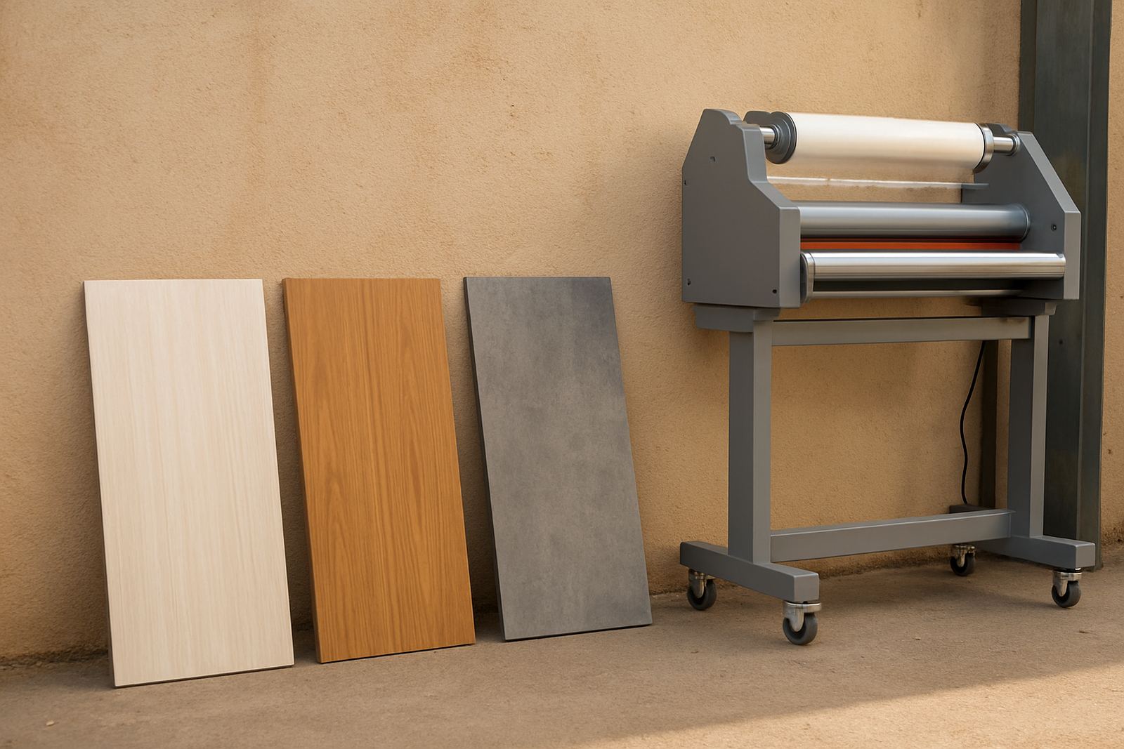
Why the film finish matters on indoor boards
Indoor signs often sit under LED downlights, shop strip lighting, or near windows where daylight shifts through the day. That means the wrong finish can show glare, fingerprints and surface marks long before the print itself looks tired. For display boards, menu panels, price lists and wayfinding signs, the top layer needs to do a proper job without changing the message.
A protective film is not only there to keep the print safe. It also controls how the colours read from a distance, how the board feels to the touch, and how easy it is to clean. In offices in Sandton or reception areas in Midrand, a neat finish can make a simple board look far more considered, while in a busy retail space in Randburg the same board may need extra scuff resistance.
- Gloss gives stronger colour pop and a smooth look.
- Matte cuts glare and suits bright rooms.
- Textured films can hide light handling marks.
- Anti-scratch options help on signs touched often.
Gloss, matte, satin and texture: what each one does
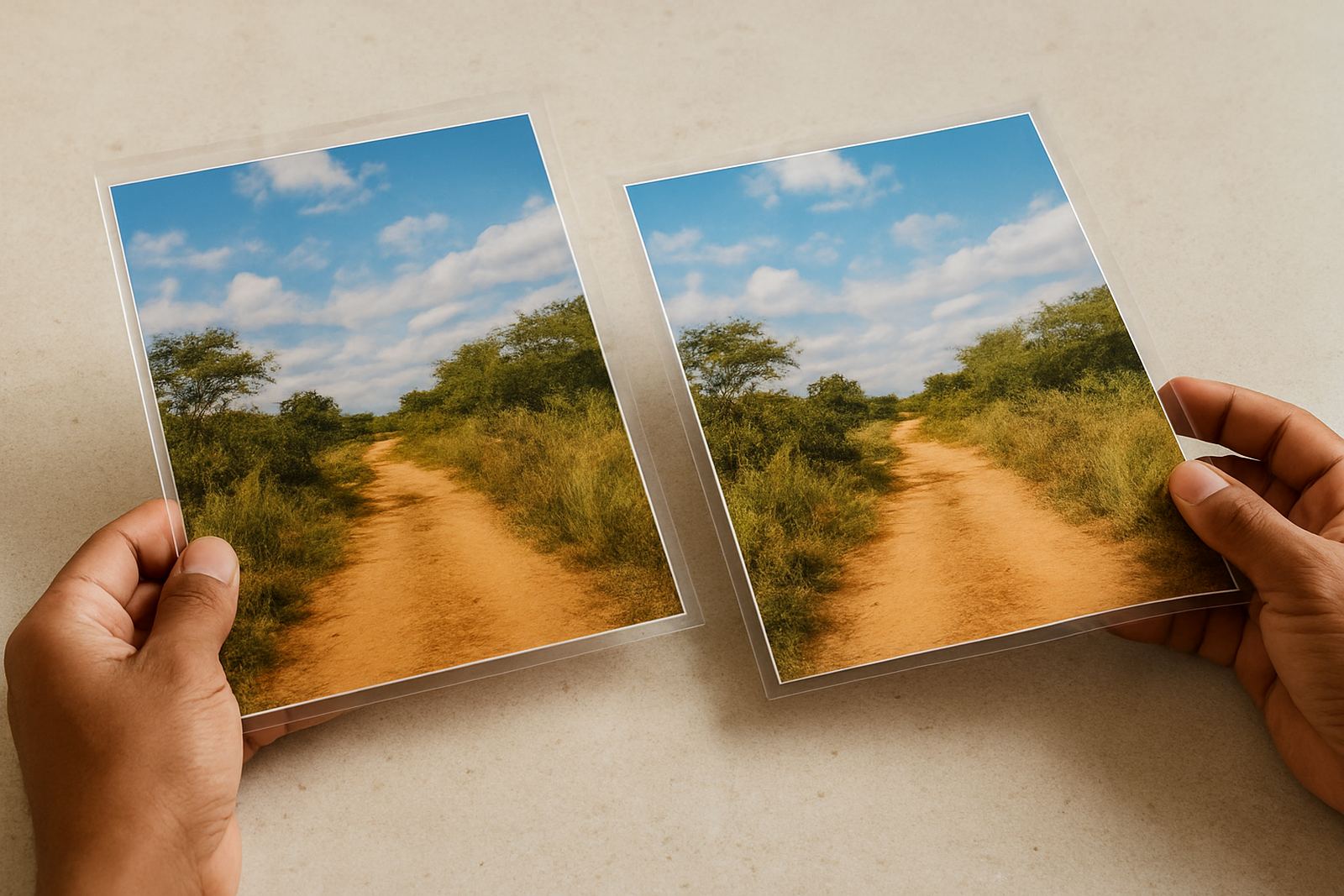
Gloss film is usually chosen when the artwork needs depth and sharp colour. It suits photo-heavy boards, retail promotions and display graphics where the surface is viewed straight on. The downside is glare. Under hard lighting, gloss can reflect enough to make reading more difficult, especially if the sign is mounted higher than eye level.
Matte film is the safer option for offices, training rooms and conference spaces. It reduces reflection and gives the print a calmer finish. Satin sits between the two, with a softer sheen that can work well when you want a neater look than matte but less shine than gloss. Texture is useful where hands will touch the surface, because it can hide very small marks and give the board a more tactile feel.
For municipal notice boards, estate direction boards and internal shop signage, the finish should match the viewing distance and light source. A glossy film on a board near a north-facing window in Pretoria can look fine in the morning then become hard to read by midday, so it pays to test under actual light.
- Use gloss for colour-heavy graphics and short viewing distances.
- Use matte for glare control in bright rooms.
- Use satin for a balanced office or retail finish.
- Use texture where handling is frequent or light marks are common.
Cold roll or hot roll laminating for indoor signage
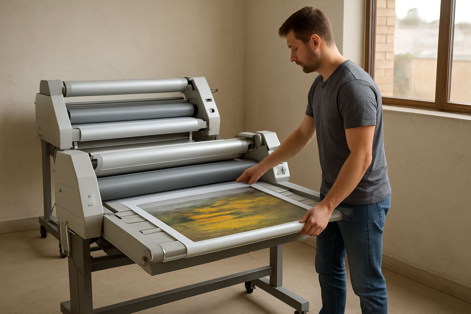
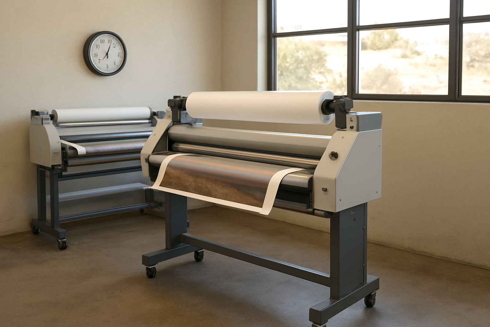
Indoor signage work usually comes down to either cold roll lamination or hot roll lamination. Cold roll is preferred for many printed graphics because it avoids heat that can affect sensitive ink systems, vinyls or lightweight boards. It is also useful for larger sheets where you need control and consistency from edge to edge.
Hot roll systems are better suited to certain film types and jobs that benefit from heat activation. They can give a firm bond on the right substrate, but they need correct temperature settings and careful handling. If the heat is too high, you can get distortion, tunnelling, or a board that bows a bit after finishing.
For print shops in Kya Sand, a good rule is to match the machine to the work most often produced. If the bulk of your output is office signage, presentation boards and display pieces, choose a setup that gives steady pressure and easy cleaning. In humid coastal areas the film can behave differently too, so pressure and roller condition matter more than many operators expect.
- Cold roll suits heat-sensitive prints and general indoor graphics.
- Hot roll suits films and substrates designed for temperature bonding.
- Even pressure is as important as the film itself.
- Humidity can affect handling, so storage and setup matter.
Matching the film to the board, not just the artwork
The base material matters. Foam board, MDF, PVC sheet and rigid display board all react differently when film is applied. A light board may flex under too much pressure, while a dense board can show trapped dust if the surface is not cleaned properly first. For this reason, sign finish choice should always start with the substrate and where the board will be used.
In a busy showroom, the sign may be touched, wiped and moved around often. In that case, choose a film that can take cleaning with a soft cloth and mild detergent. In a boardroom, a non-reflective finish may be better than a shiny one because it keeps the message readable during meetings and presentations. If the artwork includes dark blocks of colour, note that some matte films can soften contrast slightly, so the test print should be checked before a full run.
Outdoor-grade protection is not always needed indoors, but rooms with direct sun through glass can still cause fading and surface stress. In those spaces, a slightly stronger film can help, even if the sign never leaves the building.
Local print shop example from Kya Sand
A print shop in Kya Sand preparing internal signage for a chain of offices in Johannesburg had three different board types on the same order. The reception sign needed a cleaner, low-glare finish because it sat opposite glass doors. The directional boards for the passageway could use satin, while the training room panels needed matte so the presenter lights did not throw reflections across the room.
That mix saved time and avoided a one-size-fits-all result. It also reduced complaints from the end client, because each space got a finish suited to how people actually use it. The shop also cleaned the rollers before the run and checked pressure settings on a test sheet, which helped keep the edges neat and the surface free of haze. Small setting changes made a big difference, and the final boards looked right first time.
- Reception area: matte or soft satin to control reflection.
- Passageway boards: satin for a tidy general finish.
- Training rooms: matte for presentation clarity.
- Touch points: stronger film where hands will wipe or press.
Keeping laminated signs looking right over time
Most indoor signs fail from handling, cleaning habits or poor storage rather than from the print alone. Sheets stacked in a hot storeroom can pick up curl, while dust on rollers can leave marks that only show after trimming. Regular servicing helps avoid those problems and keeps output consistent from one job to the next.
Operators should check roller condition, pressure settings and heat controls before a run, then clean surfaces after jobs involving adhesive residue or heavy coverage. If the machine starts leaving streaks, that is often an early sign that the rollers need attention or the pressure needs calibration. When a team knows the machine well, the film choice becomes more predictable and waste drops.
For businesses working across Gauteng and beyond, on-site breakdown support and spare parts access can make the difference between meeting a deadline and missing one. A laminating setup does not need to be fancy, but it does need to be reliable, especially when the order is due before a fit-out handover or a client launch. Keeping the process tight is usually cheaper than redoing a run later, and it saves a lot of grief.
What to ask before you choose the finish
Before ordering film, ask how the sign will be used, where it will hang, and what kind of light falls on it. Then check whether the client wants a clean boardroom feel, a brighter retail look, or something that can withstand frequent wiping. If the answer is not clear, do a sample and review it in the actual space. That simple step avoids guessing.
- Will the sign sit under bright lights or near windows?
- Will people touch or clean it often?
- Does the artwork need strong colour pop or low glare?
- Is the board rigid, light, or likely to flex?
- Will the sign stay in one place or be moved around?
The right finish is not about choosing the most expensive option. It is about picking the film that suits the room, the board and the way the sign will be used. That is how indoor signage stays clear, neat and worth keeping up.