
Why reflections spoil display prints
Anyone who has stood in front of a poster under a downlight knows the problem. The print may be sharp on the table, but once it goes on the wall the surface throws back light and key details vanish. That becomes a real issue for training boards, price lists, trade show graphics and artwork that needs to be seen from across a room.
In Johannesburg office parks, retail centres and school corridors, lighting is often mixed. You get natural light near windows, cool white ceiling fittings inside, and strong spotlights over reception counters. A glossy print can look fine in one corner and unreadable in the next. Anti-glare display prints are made to reduce that reflection so the viewer sees the message first, not the shine.
Where anti-glare finishing makes the most sense
Not every print needs the same finish. If a piece is meant for a shaded room, a bright foyer, or a venue with camera flashes, the surface choice matters as much as the artwork itself. For businesses in Kya Sand, Sandton and Midrand, we often see anti-glare used on materials that must stay legible all day and not only in perfect light.
- Posters in reception areas with overhead lighting
- Presentation boards used at client meetings or tender submissions
- Retail displays placed near windows or glass doors
- Menu boards and pricing signs in cafés and takeaway counters
- Artwork and promotional panels for exhibitions and roadshows
If the print is going to be handled often, mounted near a light source, or viewed from different angles, an anti-glare surface is usually worth the extra attention. It saves time later because you do not need to keep moving the board around to make it readable.
Choosing the right laminate or display surface
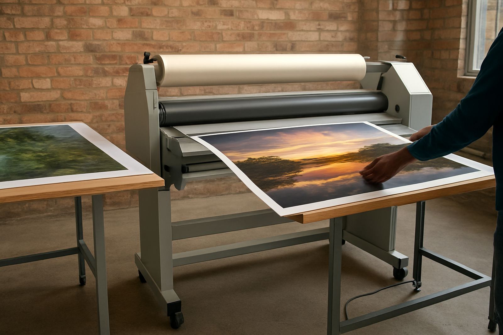
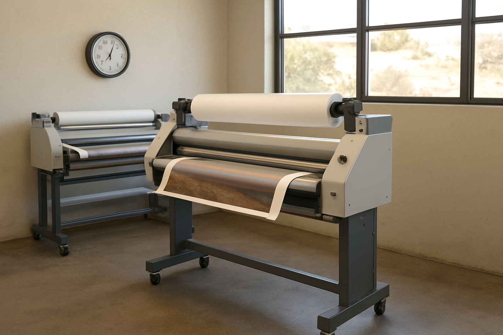
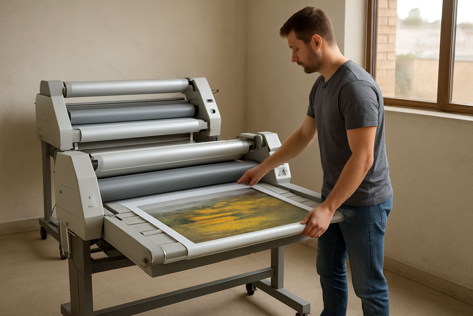
The finish you choose should suit the print type and the use. A cold roll laminator is useful for many graphics that must be protected without heat stress, while a hot roll machine can suit heavier work where a stronger bond or a different finish is needed. For display boards, the aim is not only protection, it is also presentation. The surface should cut glare without making the image look washed out.
Matte and anti-glare films are often preferred where lights are fixed and cannot be moved. They soften reflections and help viewers read smaller text. On the other hand, some work still needs a slight sheen for colour punch, so the right choice depends on the room, the angle of viewing, and how long the display will stay up. In coastal towns, humidity can also influence the final result, especially if prints are stored near open doors or transported before fitting.
- Use matte or anti-glare film for bright interiors
- Check whether the print needs scratch protection as well as reduced shine
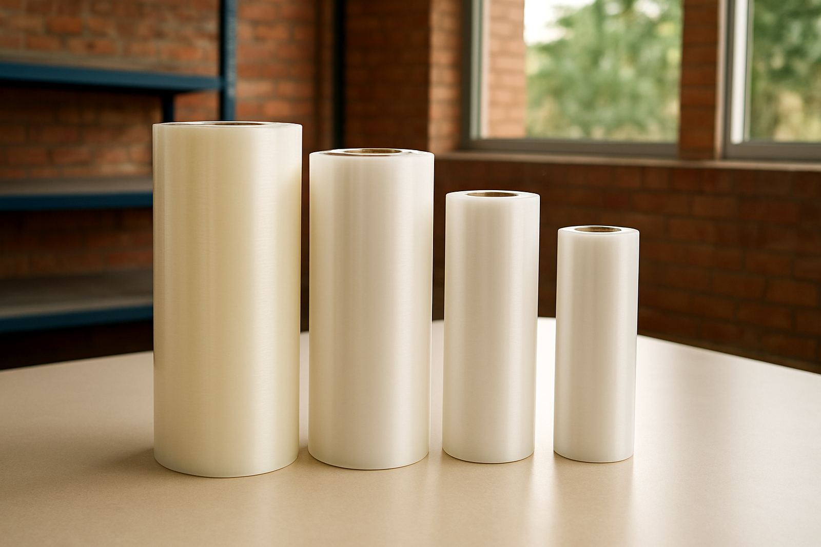
- Match the film width to the board size to avoid joins
- Test a sample before committing to a full run
- Allow for mounting holes, trims and edge sealing where needed
Local example: a Sandton boardroom with too much glare
A practical example comes from a Sandton training room where presentation boards were hung opposite a bank of windows. By mid-morning the sunlight and ceiling fittings made half the room struggle to read the agenda boards. The content was correct, but the finish worked against it. The fix was simple: switch the boards to a reduced-glare surface, then position them slightly off the direct light line.
After that change, the same boards could be read from the back of the room and during afternoon sessions when the light shifted. That sort of adjustment matters across Gauteng, especially in office spaces where load-shedding backup lighting can be harsh and uneven. When the lights come back on, a glossy board can flare badly, while an anti-glare finish stays more usable.
For schools, clinics and municipal waiting areas, this is even more practical. Notices must stay visible, not just look good on day one. If people have to lean sideways to read a sign, the display is failing its job.
What to check before you send a print for finishing
The best results come from planning before the print is cut or mounted. Measure carefully, allow for the full bleed, and think about where the light source will land. A board that looks fine on the workbench can react very differently once it is fixed near a window, under a fluorescent strip, or beside a reflective counter.
- Confirm final size in millimetres, not roughly by eye
- Decide if the print will be framed, mounted or hung free
- Check whether the board must be cleanable after fitting
- Ask if the print will be viewed straight on or at an angle
- Consider whether fingerprints will show during handling
For larger sites in Pretoria, the East Rand or Randburg, it can also help to plan installation after hours. That avoids dust, keeps staff out of the way, and gives the finished piece time to settle before the space is used again. Small details like this can save rework, especially on repeated corporate or retail rollout jobs.
Keeping anti-glare prints looking sharp over time
Anti-glare does not mean maintenance-free, but it does make life easier. A good finish should be cleaned with a soft cloth and the right solution, not harsh chemicals that can cloud the surface. If the print sits in a reception area or near a public walkway, regular wiping will keep it presentable and prevent dust from dulling the image.
Machine care matters too. Rollers should be clean, pressure settings checked, and heat systems tested where relevant so the film lays flat and bonds correctly. If the output starts showing silvering, bubbles or edge lift, the issue is often in the setup rather than the artwork. That is why servicing, pressure calibration and heat checks are part of the job when display work must hold up in daily use.
For businesses across Johannesburg and nationwide, the aim is simple: keep the print readable, neat and fit for the space it lives in. Anti-glare finishing helps do that without changing the message or overpowering the design.